
I use primarily VanSon Rubber based ink that come in Pantone colours. Below I've mixed a TINY bit of Relex Blue and Bordeaux Red with Transparent white, adding tiny amounts until I got the colour I wanted, the overlapping ink then produces purple. The effect is watery in appearance and the choice of paper stock can also alter the appearance and colour.
What depth you want the colour if just a personal preference but don't forget it is better to add the tiniest amounts at a time, it's a lot easier to darken your colour than to suddenly find you have to add large amounts of transparent white to get it lighter :)
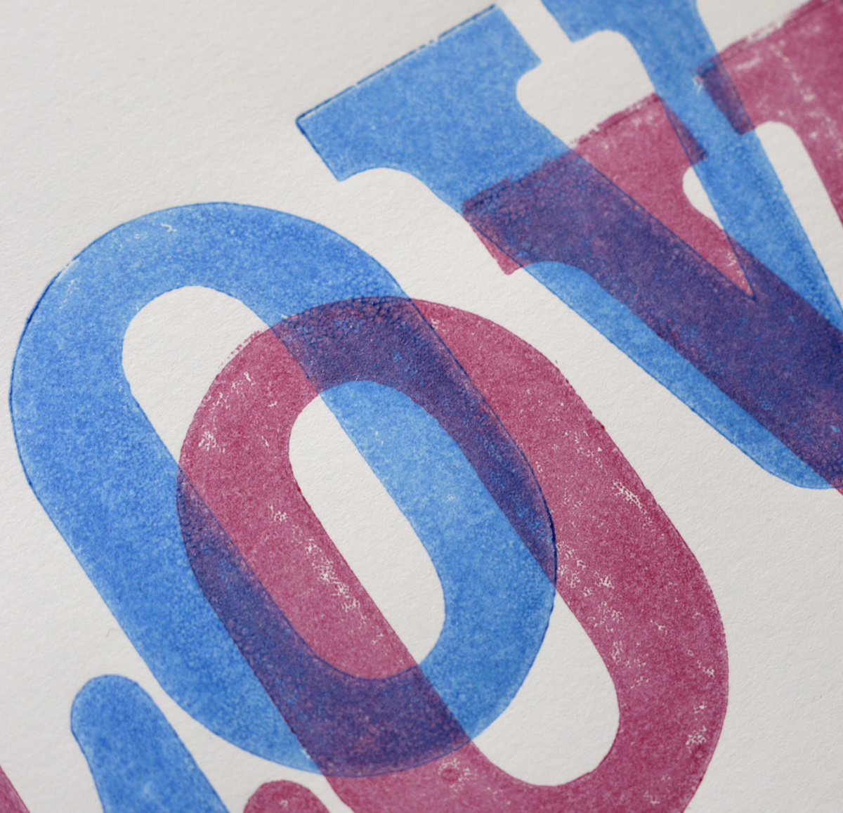
I just love the colours in the photo below, the starting point for a new project :)

There are several relief inks on the market if your not bothered about matching Pantone colours (links available under supplies on the right) but bear in mind some of these are primarily made for fine art printmaking so if you just want to print relief art then these may be for you! These too offer a transparency extender but from what I can gather, as I have never used these inks, is that some of the colours are already transparent/semi transparent/semi opaque, so straight from the tin a blue overlapping yellow would give a green.
If anyone has any info on transparency effects with ink they would like to share, post a clickable link in the comments below, and if you want know how to post clickable links in read this from the very helpful Haptree :)
I just love this effect!
ReplyDeleteThanks Leanda, you have inspired me :)
ReplyDeleteLove the transparency you have achieved with the inks. I have just aquired some tins of Van Son ink (came with the metal letterpress cabinet). I love the stuff despite almost breaking my pallet knife getting it out of the tin !
ReplyDeleteThanks Ian - He He! I keep mine in the house where it's warm, you can always try warming the tin in a jug of hot water :) I've had to invest in a good quality ink knife for mixing!
ReplyDeleteVery nice effect :)
ReplyDelete