30.4.10

$600 worth of prizes up for grabs


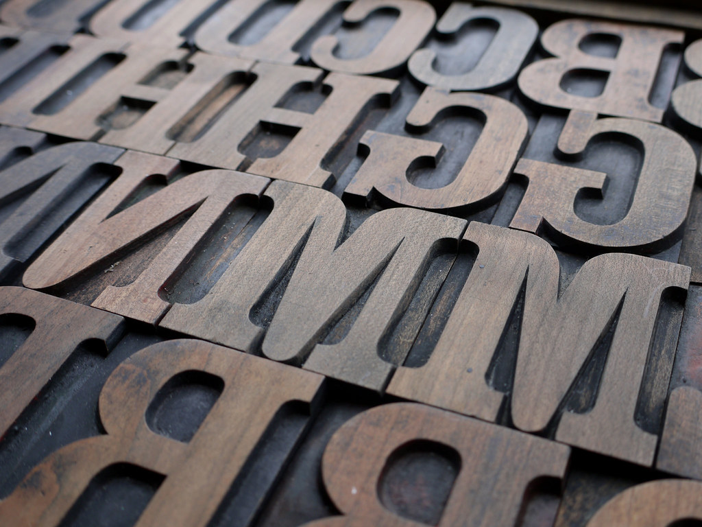
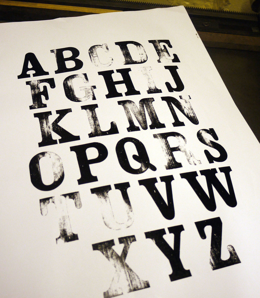
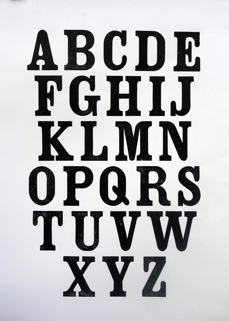
letterpress week at oh,hello friend!
image by: letteria

Last day to check out all the great giveaways and some great letterpress inspiration!

23.4.10

Edward Bawden - A Frog and an Ox

picture from the BOOK ROOM ART PRESS
Colour linocut, 1970. In the 1970’s Bawden made a series of prints based on Aesop’s fables. The frog, with feet firmly balanced on the water-lily, puffs himself up to twice his normal size. He points towards a passing Ox and, boasting to his companions, suggests that he, too, can be the size of this Ox. His companions doubt this, and with each puff deny that he has yet reached the Ox’s size. Determined, the Frog continues puffing until, finally, he bursts. The moral? Rather than imitate others, be true to your self.
A little Friday inspiration for you from the talented Edward Bawden and lots here more on flickr
Looks like we are in for a sunny weekend in the UK I'm off to enjoy it while it last... anybody got anything nice planned?

12.4.10

Letterpress Specimen French Audebaud


During the cold winter months I promised Matt Desmond of MADtype a Letterpress type specimen of my 12 line French Egyptian in return for the digitised version he designed, well I finally got round to it and discovered in the printing that someone had attempted to clean up the type so much (probably sanding) that I got this results...
So after lots of make-ready I finally achieved a half decent print, though I'm probably going to have to give the wood type a coat of shellac to seal it as it was soaking up the ink! For those who want to know what make ready is you add small amounts of tissue, in layers, to the back of sort (letters) a their weakest point, you can also try replacing individual letters. Their is a more in depth article on the Happy Dragon Press Website who also sell Make Ready tissue, I actually used ripped newsprint for mine as it was so bad. Here's Matt's print in black as requested


Here's Matt digitised version, pitty I don't have a lowercase! He's done a great job don't you think? I particularly like the lowercase "j" and "y" and the teardrop counter in the capital "A" makes me go weak at the knees :)


There's a makers mark on the wood type which is hard to see never mind photograph, which reads AUDEBAUD BRESSUIRE (2 SEVRES)
Matt did some sleuthing and found out that the person who created it was named Constant Audebaud. He worked as a wood type engraver in the 1880s in the Bressuire subprefecture of the département of Deux-Sèvres in France hence the name Audebaud, only fitting he named his type this don't you think?

Audebaud is available here
Related Posts with Thumbnails